You’ve invested time and money into your website; it looks the way it should, loads quickly, works on mobile and follows best practices. But the leads aren’t coming in the way you expected and you are not sure why?
This is one of the most common frustrations we hear from companies in the professional services, commercial real estate and construction industries. And honestly? The problem is rarely technical. A website that looks great but does not generate leads is almost always missing something strategic.
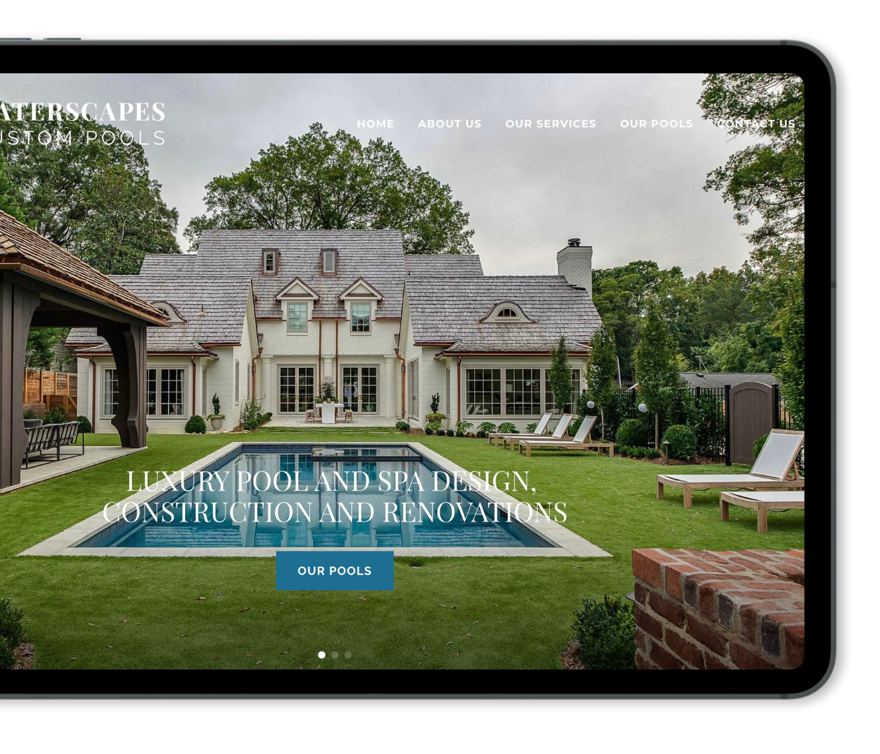
Problem 1: Your homepage is not answering the questions that matter most
When someone lands on your website for the first time, they make a quick decision about whether to stay or leave. That decision happens in a matter of seconds and is driven almost entirely by whether they immediately understand what you do, if it’s relevant to them, and what they should do next.
Those three questions, what do you do, who you do it for, and what to do next, need to be answered on your homepage without any effort from the visitor. If your messaging is vague, loaded with technical jargon your clients don’t understand, or so focused on your firm’s history that it doesn’t speak to the person reading it, you’re losing people before they ever reach your internal pages.
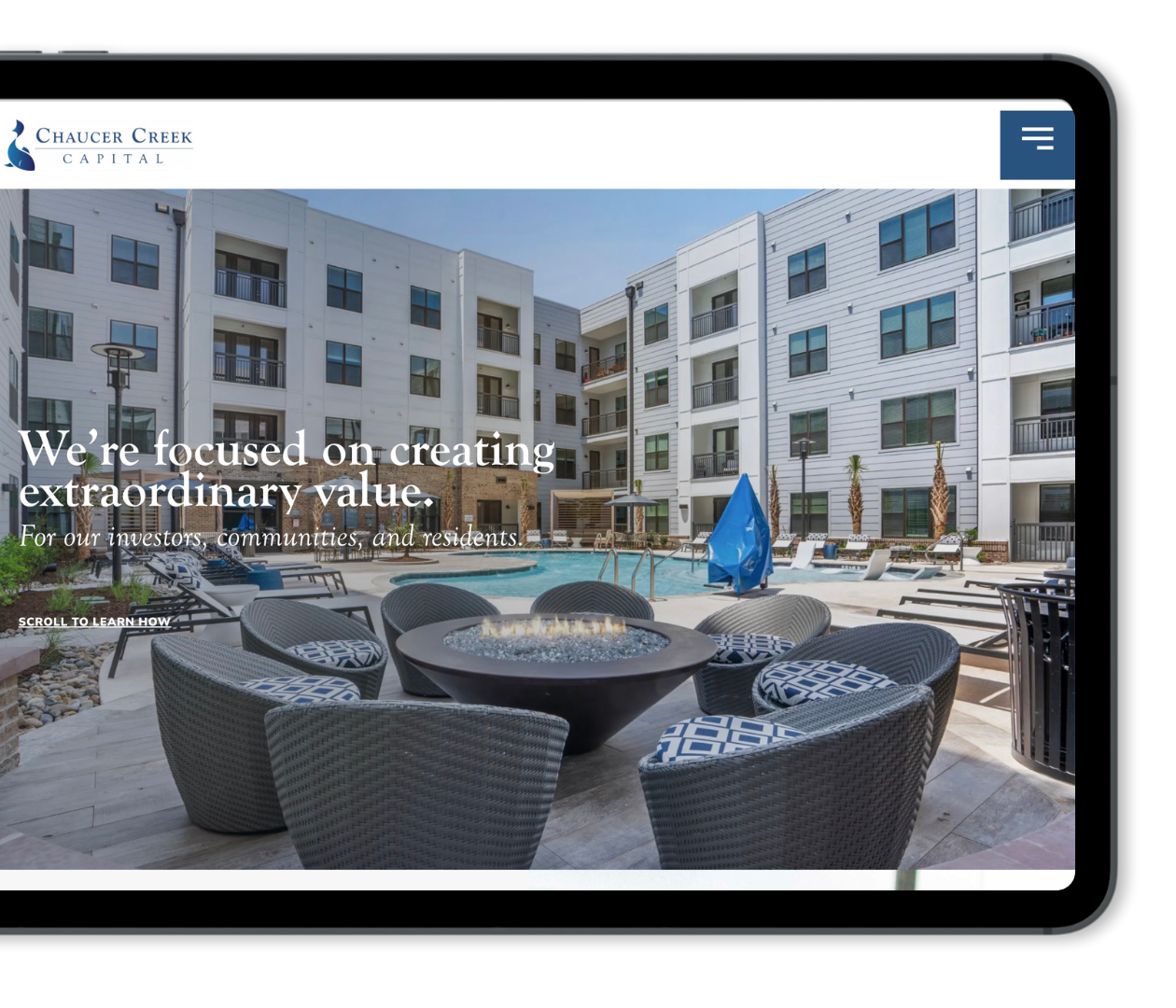
It’s not about dumbing things down, it’s about being direct. A commercial real estate firm whose homepage opens with a clear statement about who they serve and what those clients can expect will grab attention far longer than one that leads with a mission statement and their company history. Specificity creates the feeling of relevance and clarity and that’s what keeps someone reading.
Problem 2: There is no clear path for the visitor to follow
Lead generation is a process, and your website needs to be designed with that process in mind. A visitor who lands on your services page with no clear next step is a visitor you’ve already lost. They aren’t going to hunt for your contact page. They simply leave and move on.
The path through your website should feel intuitive. Each page should have a logical next step, whether it’s learning more about a specific service, reading a relevant case study or getting in touch. That flow should replicate the way your ideal client actually makes decisions: what they need to understand first, what they need to see before they trust you and when or how to reach out.
If someone lands on your site having never heard of your firm, a contact form alone is not enough. They need enough context to understand who you are and whether you’re the right fit. Building that user journey into your site, rather than expecting visitors to find their own way, is one of the highest-impact changes you can make to increase engagement and leads.
Problem 3: Your site is not giving people a reason to trust you
In high-trust industries, credibility is everything. And credibility online comes from social proof. Testimonials, case studies, recognizable client names or logos, relevant credentials, industry affiliations; these are the trust signals that inform a prospective client you are legitimate before they ever reach out.
A lot of companies underestimate how much this matters. If a prospect is evaluating your firm alongside two or three others, and your competitors have detailed case studies and client testimonials while your site is missing the mark, you’re starting at a disadvantage.
The good news is that most firms have more social proof than they may realize, but they just haven’t put it on their website in a useful form. A few well-written case studies that walk through a client’s situation, what you did, and what changed as a result can do an enormous amount of work. They answer the question every prospect is quietly asking: has this firm done this work before for someone like us?
Problem 4: Your calls to action are only speaking to one type of visitor
Not everyone who lands on your website is ready to book a consultation. Some are early in their research. Some are not yet sure whether they need what you offer. If the only option you give them is “contact us,” you are losing everyone who is not ready for that step.
Think about where a visitor might be in their decision-making process and give them somewhere useful to go at each stage. A project gallery gives someone who is still exploring a reason to stay longer. A downloadable guide or checklist gives someone doing research a reason to share their contact information without feeling like they are committing to a sales conversation. A strong set of case studies gives someone who is close to a decision the evidence they need to move forward.
Meeting visitors where they are — rather than where you want them to be — is what keeps them engaged long enough to eventually convert.
Problem 5: Your forms are working against you
This one is simple but worth saying plainly. If your contact form asks for more information than is necessary to start a conversation, you are losing leads at the finish line. People are busy and cautious about sharing information. A form that asks for project budget, timeline, company size, and several other fields before you have established any relationship is going to see a lot of abandoned submissions.
Ask for what you actually need to take a meaningful next step — usually a name, an email, and a brief description of what they are looking for. You can gather everything else once the conversation has started. The goal of the form is not to fully qualify the lead. It is to get the door open.
Measure what is actually happening, then improve from there
Once the foundational pieces are in place, the work shifts to understanding what is working and what is not. Where are visitors dropping off? Which pages are holding attention and which are losing people quickly? Which calls to action are getting clicks and which are being ignored?
This is not about obsessing over data. It is about making informed decisions instead of guessing. Even a basic review of your site analytics on a regular basis can reveal patterns that point you toward the next thing worth fixing. A high-traffic page with a low conversion rate is telling you something. A page with a short average visit time is telling you something. Learning to read those signals turns your website from a static asset into something you can actually improve over time.
The goal was never just to have a website that looks good. The goal is a website that makes it easier for the right people to find you, trust you, and decide to reach out. When those pieces are working together, the leads follow.
If your website looks good but is not bringing in the leads you expected, let’s talk.
At M|J Creative, we work with firms in professional services, commercial real estate, construction, and architecture to close the gap between a website that exists and one that actually works. If you are ready to take a closer look at what your site is — and is not — doing for your business, we would love to talk.