Key Takeaways
This article walks through a simple approach to communicating what you do clearly on your website: lead with the outcome, translate anything technical, design the page so people can scan it, back it up with proof, and end with an obvious next step.
Most websites are written the way you’d explain your work to a colleague, not the way you’d explain it to the person deciding whether to hire you. That gap is usually where potential clients lose interest and click away from your website.
The businesses that struggle most online aren’t the ones explaining things too simply, they’re the ones who never simplify at all. Their website reads like it was written for someone inside the industry, instead of the person actually trying to figure out if this company can help them.
There’s an old adage we come back to: tell me the time, don’t build me the clock. Your client doesn’t need every detail behind your work explained up front. They simply need the answer. Everything else is detail you can address later in your sales process.
Lead With the Outcome, Not the Explanation
When you’re describing what you do, the instinct is often to explain it the way you would to a peer, methodically, starting with the process. But your website isn’t the place for that. At least not at first. On your website, it’s important to get to the bottom line, stated clearly and succinctly.
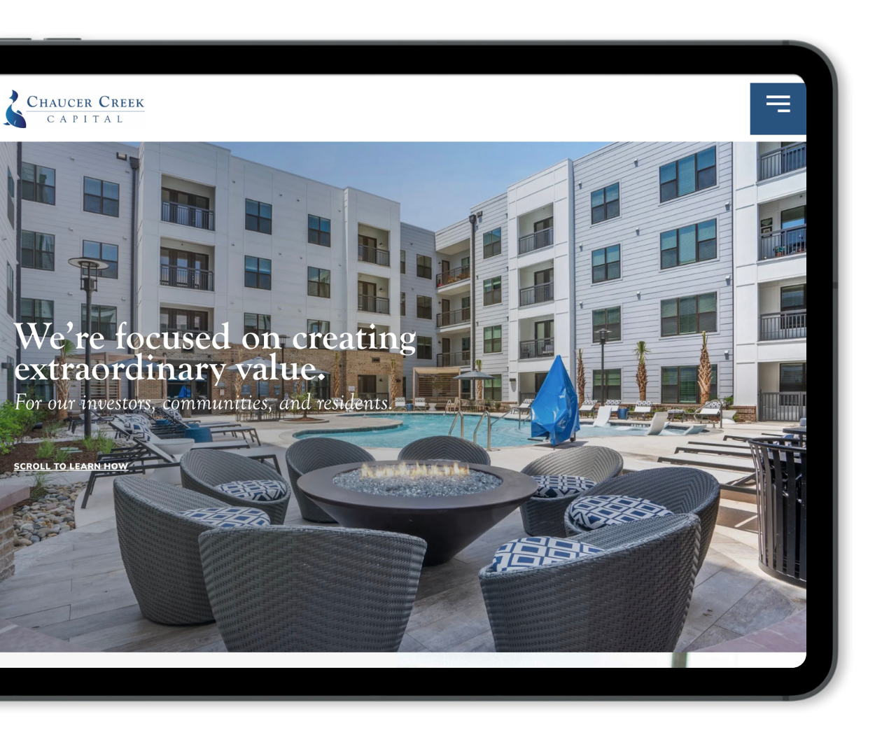
This means your homepage and service pages should open with a clear statement about what a client gains from working with you, not a detailed walkthrough of how you do it. We see this constantly with engineering and construction clients. A headline like “Structural Engineering Services” tells a building owner nothing they didn’t already guess from the page title. “We Keep Your Building Project Moving Without Surprises From the City” tells them what they’re actually getting. Same firm, same services, but now the headline is doing the real work.
If you offer several distinct services, resist cramming all of them onto one page. Each service deserves its own page to make the case for why the visitor needs it. Trying to explain everything at once usually means nothing is being explained well.
What If Our Services Are Technical?
If a technical term is unavoidable, don’t leave it sitting there unexplained. State the term, then immediately describe what it means in plain language.
Sometimes a plain-language definition still isn’t quite enough, especially for services that are more complex. This is where a familiar comparison or analogy does real work. Take, for example, a business law firm that drafts buy-sell agreements for privately held companies. Explained technically, this is a document governing ownership transfer, valuation, and funding mechanisms between partners. Explained through an analogy, it’s similar to a prenup for business partners, something you put in place while everyone’s getting along, so a partner leaving or passing away doesn’t turn into a fight over the company’s future.
We’ve used the same approach with a commercial real estate client explaining triple net leases to first-time tenants. The technical version covers pass-through expenses and pro-rata operating costs. The plain version is closer to: you pay a lower base rent, but you’re also responsible for your share of the building’s taxes, insurance, and upkeep, so the total cost isn’t just the number on the sign. Same lease structure, same terms, but now the reader understands what they’re actually agreeing to.
Design the Page So People Can Actually Scan It
Nobody reads a website top to bottom, processing every sentence. Most people glance at a page for a few seconds and scan for the content that answers their question. If nothing does, then they leave.
A useful way to check your own pages is to imagine someone landing on the site cold and asking a few things: “What is this?”, “What page am I on?”, “Where does this fit into what the business offers?”, and “What are my options from here?” If your website page can’t answer these within a few seconds, through the headline, the layout, and content that’s visible before scrolling, then visitors are likely to move on to your competitors.
Short paragraphs are helpful. As are clear subheadings that let someone skip to the content that’s relevant to them. Take, for example, a professional services firm listing out a multi-phase engagement. Instead of one paragraph describing the whole process, break it into subheadings like “What Happens First,” “What You’ll Receive,” and “How Long It Takes.” A visitor scanning for timeline information finds it in two seconds instead of reading three paragraphs to get there. Bullet points are useful in small doses too, particularly for listing specific deliverables, but they work best as a supporting tool rather than the entire structure of a page.
Back It Up With Proof, Not Just a Claim
Trust matters more with specialized or technical services, because the client often can’t fully evaluate the work themselves. They’re trusting your judgment. That means telling them you’re good at something matters way less than actually showing them.
A specific case study, a real testimonial, or even a single sentence describing an actual client result does far more than a list of general claims ever will. Compare “We provide excellent service to our commercial real estate clients” against “Helped a property management firm cut vacancy time by three weeks by rewriting their listing pages to answer the questions prospective tenants were actually asking.” The second one proves the exact thing this article is arguing for. If you have a real metric or a client story, use it.
Giving away some expertise up front also builds trust. A useful blog post or short guide that answers a real client question shows depth of expertise without giving away a whole engagement. It tells someone you know what you’re talking about well before they’ve spent any money.
End With One Clear Next Step
Once someone understands how you can help them, don’t make them guess what to do next. Every page describing a service on your website should end with an obvious next step, whether that’s scheduling a call or requesting a proposal.
But not everyone is ready for that yet. Some visitors are still comparing options. So a lower-commitment option sitting alongside your main call to action, like access to a short resource or guide, keeps them engaged with you instead of losing them to whoever else answers their question. “Schedule a Consultation” next to a smaller “Not Ready Yet? Download Our Project Planning Guide” covers both groups on the same page instead of forcing everyone toward the same ask.
Confusion doesn’t build trust. Clarity does.
If your website currently reads like it’s written for people inside your industry instead of the clients trying to hire you, that’s fixable. It usually just takes rebuilding the page around what the client actually needs to know first.
If you’d like a second set of eyes on your website, that’s something we help clients with regularly. Starting with a straightforward look at what’s working and what’s not.