We look at a lot of websites. It’s one of my favorite parts of this work and also one of the most frustrating, because the gap between what a company’s homepage should be doing and what it’s actually doing is bigger than people realize.
Specifically for B2B companies and professional services firms, the homepage tends to fall into one of two categories. It either tries to communicate everything and therefore ends up saying nothing. Or the homepage leads with how long the company has been in business and a stock photo. And neither of those is doing the company any favors.
Here is what we believe actually works.
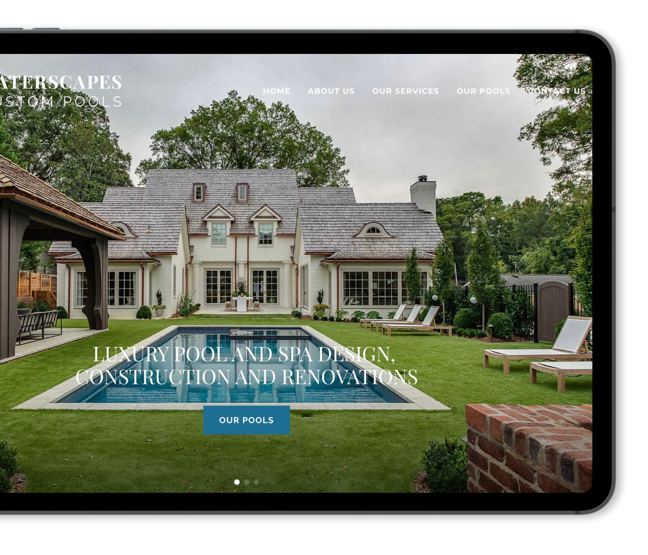
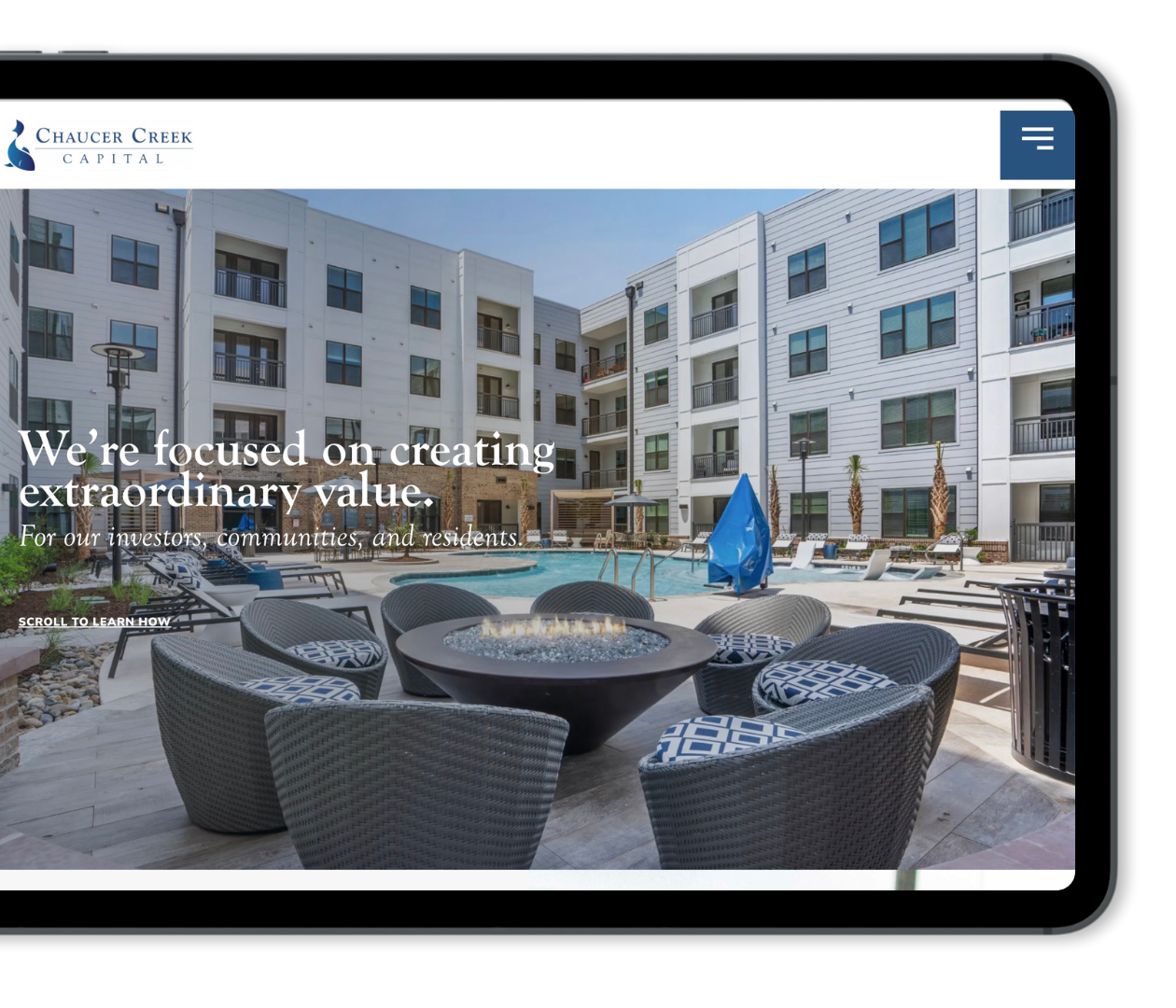
Visitors Make a Decision in Seconds
The research on this is pretty consistent; people make a judgment about a website within just a few seconds of landing on it. Not minutes, but seconds. And for the kind of firms we work with, those visitors are busy CEOs, marketing directors, project leads, so they’re not going to give you extra time just to figure out what they need to know.
That means your homepage has one main job – immediately make the right person feel like they have landed in the right place. If a user has to scroll and hunt to figure out what you do, who you do it for and what sets you apart then you’ve already lost them.
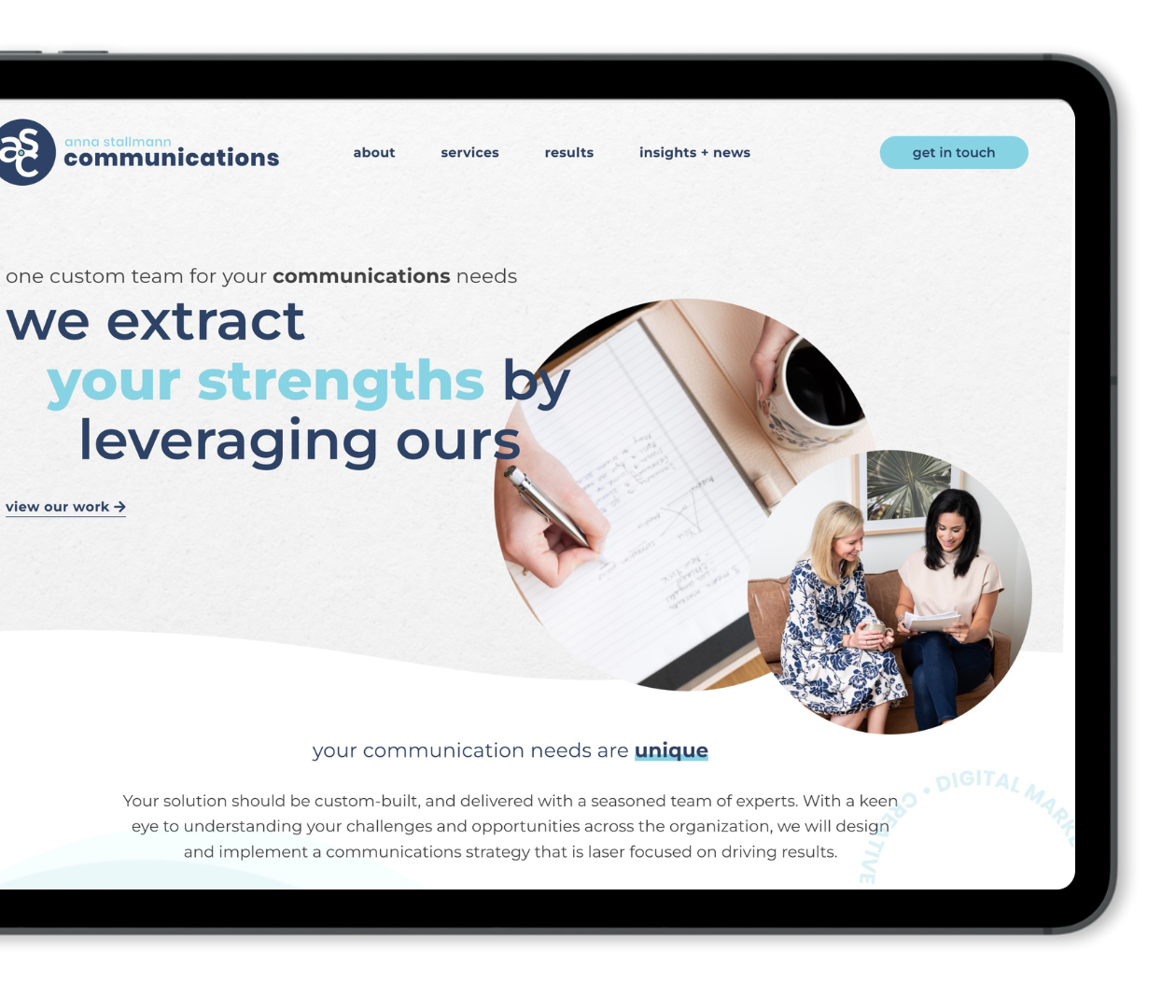
Lead With Clarity and Not Cleverness
This is something I come back to over and over again with clients. The top of your homepage, what we call the hero section, needs to communicate these three things almost instantly: what you do, who you do it for and why it matters to them.
That sounds simple, but it rarely is.
We see clients with the temptation is to lead with something clever or brand-forward, like a tagline that sounds great internally but leaves a visitor confused. What we’ve found is that clarity almost always outperforms cleverness for audiences in B2B and professional services. Don’t let your brand voice get in the way of what you are really saying.
Social Proof Has to Come Early
In professional services industries like engineering, construction and CRE, trust is absolutely everything. Your potential clients are often making a significant investment and they are doing their due diligence before they ever even reach out. This means your homepage needs to show real social proof and not just make empty claims.
This doesn’t have to be a wall of testimonials, it can be strategically placed client logos, outcomes from a real project, or case study overviews that link somewhere deeper on your website. The point being that something on that page should signal to a visitor that other credible people have trusted this firm and it was successful.
And the higher up on the homepage that signal appears, the better.
Website Navigation Should Guide and Not Overwhelm
We see homepages all the time where the navigation has eight or nine items, with multiple dropdown menus, across the top of the site. Many people think that more options means they are more likely to click on those items but what it actually does is create friction.
For B2B or professional services firms, your navigation menu should be reflective of your client’s decision-making journey and not your internal org chart. Think about the top 3-5 things a qualified prospect needs to see to move forward and make those the easiest to find.
Bottomline: Don’t let your website navigation turn into The Cheesecake Factory menu. Keep it concise and easy to understand and users will be more likely to stay on your site and explore further.
Content Below the Fold Matters
A lot of attention goes to the hero section (also called the area “above the fold”) on a homepage, but what comes after it matters too. Especially for visitors who are genuinely evaluating your company.
The middle of your homepage should be where you continue telling the story of what you do and how you do it. Content like who the company has worked with, what the process looks like at a high level and even recent articles demonstrate your expertise and differentiation to the visitor.
Think of this as the difference between a first impression and a first conversation with a potential client. The homepage hero gets them to stay and the rest of the homepage gives them a reason to reach out.
Clear Next Steps
You can have a beautiful, well written homepage and still lose people if there is no clear path forward.
Every section of your homepage should include a natural next step. We don’t mean a hard sell, or a pop-up that appears before anyone reads a single word. Just a clear invitation to go somewhere else on your site, like “Learn more about our team”, “See our work”, “Let’s talk” etc.
For the firms we work with, this usually means one primary call to action that shows up consistently and sometimes a secondary option for people who are not quite ready to reach out but want to keep exploring the site.
What We See
When we dig into a homepage that isn’t converting the way it should, we tend to surface the same types of issues. The overall messaging is too vague. The social proof is buried or missing entirely. The main navigation is trying to do too much. And there is no clear path guiding a visitor from one section to the next.
It’s not a design problem, it’s a strategy problem. And it’s fixable.
Your homepage is not a brochure and it’s not a place to put everything your company has ever done. The homepage is the beginning of a conversation with someone who is deciding whether they want to keep moving forward with your company.
The firms that get it right are the ones whose homepage feels effortless to navigate, answers the right questions before they’re even asked and makes a qualified prospect think, “this is exactly who I was looking for.”
And that doesn’t happen by accident.
At M|J Creative every website we build starts with strategy, because a homepage that looks good but doesn’t work is just an expensive placeholder. If you want to know how your current homepage stacks up, we would love to take a look. Reach out today!